
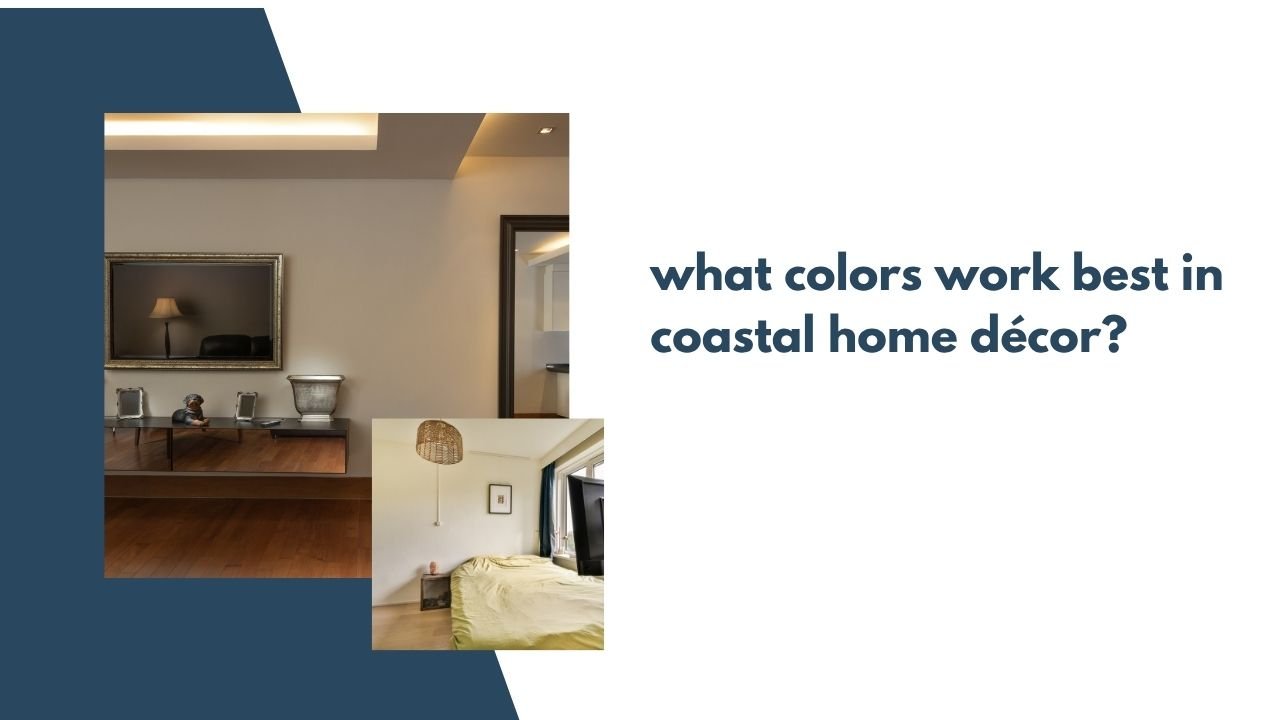
1. Soft Whites (The Foundation of Coastal Design)
White is the base color in most coastal homes.
But not harsh, bright white. Instead, think:
- Creamy white
- Warm white
- Linen white
- Soft ivory
White walls reflect light and make a room feel open and fresh. They also allow natural textures like wood, rattan, and linen to stand out.
Best use:
- Walls
- Trim
- Ceilings
- Large furniture pieces
White creates that breezy, sunlit feel coastal homes are known for.
2. Soft Blues (Inspired by the Ocean)
Blue is the heart of coastal décor. But it’s important to choose the right shades.
Best coastal blues:
- Sky blue
- Powder blue
- Misty blue
- Seafoam blue
- Muted navy
Avoid overly bright or neon blues. Coastal blue should feel soft and natural.
Best use:
- Throw pillows
- Accent walls
- Bedding
- Decorative vases
- Rugs
Blue adds a calming, ocean-inspired vibe without overwhelming the space.
3. Sandy Beige & Warm Neutrals
To balance white and blue, add warm sandy tones.
Think:
- Beige
- Oatmeal
- Driftwood
- Taupe
- Light tan
These colors reflect beach sand and sun-washed textures.
Best use:
- Area rugs
- Upholstery
- Curtains
- Woven baskets
- Wood furniture
Warm neutrals prevent a coastal room from feeling cold or sterile.
4. Seafoam & Soft Green
Soft green tones inspired by sea glass work beautifully in coastal homes.
Try:
- Seafoam green
- Sage
- Eucalyptus
- Pale mint
These shades add depth while keeping the space calm and natural.
Best use:
- Accent chairs
- Bathroom décor
- Kitchen accessories
- Wall art
Green adds subtle variety without overpowering the light aesthetic.
5. Light Gray (Modern Coastal Touch)
For a more modern coastal look, soft gray works well.
Best shades:
- Light gray
- Greige (gray + beige)
- Driftwood gray
Gray pairs beautifully with white and blue while giving a slightly more sophisticated feel.
Best use:
- Sofas
- Cabinets
- Flooring
- Accent walls
It keeps the space neutral and elegant.
6. Soft Aqua & Turquoise (Used Sparingly)
If you want a slightly brighter beach feel, use aqua or turquoise carefully.
These colors work best in small amounts:
- Throw blankets
- Glass décor
- Artwork
- Pillows
Too much bright turquoise can feel tropical rather than coastal. Use it as an accent.
7. Natural Wood Tones
Color in coastal design isn’t just paint — wood tones matter too.
Best finishes:
- Light oak
- Whitewashed wood
- Driftwood
- Natural pine
Avoid very dark or heavy wood. Lighter woods keep the space open and airy.
Quick Coastal Color Palette Table
| Color | Mood | Best Use |
|---|---|---|
| Soft White | Clean & airy | Walls, trim, ceilings |
| Sky Blue | Calm & ocean-inspired | Pillows, bedding |
| Sandy Beige | Warm & natural | Rugs, upholstery |
| Seafoam Green | Fresh & soft | Accent pieces |
| Light Gray | Modern & neutral | Sofas, cabinets |
| Aqua (small doses) | Bright & beachy | Decorative accents |
| Light Wood Tones | Natural & relaxed | Furniture, floors |
Coastal Color Combinations That Always Work
Here are a few easy-to-follow combos:
✅ White + Soft Blue + Natural Wood
✅ Cream + Beige + Seafoam
✅ White + Gray + Navy
✅ Light Blue + Oatmeal + Rattan
These combinations feel balanced and calming.
Colors to Avoid in Coastal Design
To keep the look authentic, avoid:
- Dark heavy browns
- Deep burgundy
- Neon brights
- Black-heavy palettes
- Bold red
Coastal design should feel light, soft, and relaxed — not dramatic or heavy.
Warm Coastal vs. Cool Coastal
There are two main directions you can take:
Warm Coastal
- Creamy whites
- Beige
- Driftwood
- Soft green
Feels cozy and natural.
Cool Coastal
- Crisp white
- Pale blue
- Light gray
- Soft navy
Feels clean and breezy.
Choose based on your personal style and lighting.